Hint: it’s not.
In my How Things Work general education physics class we have been working on making and reading graphs. Fun Stuff! We have been doing experiments and looking at the data to see if there is any relationship. One the thing I noticed while grading the first homework sets was that students were trying to make trends that were not there.
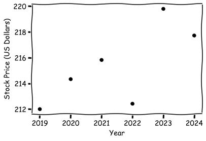
In class the other day, I handed out the following graph and asked the question, “if someone bought this stock in 2019 would it have been a good investment?” About 2/3 of class raised their hand and said it was a good investment. The reason, the trend is generally increasing. Fair logic, but…
It’s a Trap!

It was my goal to get a conversation going about relationships and noise. It did and so much more! When I designed this graph, I wanted to add an upward trend that was also in some heavy noise so nothing was clear – good for discussion bad for getting the right answer.
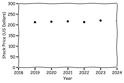
We discussed how news organizations, especially The Economist, like to trick you in this way. You always have to look at the y-axis before making decisions. We replotted it starting at zero and I asked the question about the trend again. The whole class said it was flat. It is in fact only a 2% change over 5 years.
What was interesting/surprizing was that this sparked a number of conversations about this being a good investment or not – both in and out of class. It’s always increasing, it has to be good investment, right? One of the business majors in my class practically jumped out of his seat to explain why it was a bad investment. He passionately argued that one could have bought a riskless government-backed CD that performed better of the same time (though not much better, see below). And of course, there is inflation. So, let’s add some of this data to the graph:

The blue lines are 2019 an imagary stock that costs $212 with the standard stock market rate of increase (dashed lines blue real as best as I can tell on the train, solid blue lines is an average rate, S&P500, data from investopedia.com).
The red lines are 2019 $212 value with the inflationary increase (dashed lines red real as best as I can tell on the train, solid red lines is an average rate, data from marcotrends.net).
Not only did this stock (the black dots) perform significantly below the stock market (the blue lines), it also performed worse than inflation (the red lines). So while the price of the stock did go up. It was not a great purchase. Because inflation was higher and in terms of real dollars adjusted for inflation. Thus the price went down over time (i.e., the black points are below the red lines).
What you don’t know about this company is its risk. Is it GE or a startup? That matters of course but I kept it as vague as possible just to spur discussion.
The CD point was interesting. Right now CDs are a hot buy. As I pass the bank and I see 5% APR for CDs I do a doubletake. Its like my childhood all over again – money can go in a bank account and simply make more money. But for much of 2000s the CD rates were really low. Check out this Forbes article on CD rates. https://www.forbes.com/advisor/banking/cds/historical-cd-rates/#:~:text=CD%20Rates%20From%202000%20to%202009&text=Rates%20on%20six%2Dmonth%20CDs,%2C%20rates%20fell%20to%203.14%25.
WHATEVER YOU DO, DO NOT TAKE INVESTMENT ADVICE FROM ME! I AM A SCHMUCK!


Leave a Reply