

Imagine if the sun started all-of-the-sudden spewing out more heat for whatever reason that could be bad for the world. We could suddenly heat up and the oceans could boil away. If the Earth was itself a self-regulating system that could be good for the Earth. The sun would heat up and the Earth would just self-regulate.

In 1983, Watson and Lovelock developed a model to show that it is possible that a planet such as the Earth could use biological processes to self-regulate climate processes over the entire planet. They made a simple model where the world was made up of nothing but daisies and the planet could use these daisies self-regulate. Watch this video:
So in daisyworld, white daisies have a large albedo and black daisies absorb light/energy better and have a smaller albedo.
So because I want all to get the full flavor of creating a model from scratch and what my thought process is, I am going to create my own daisyworld model and have you build it with me in real time. To be clear, my daisy model is different than the one discussed in the paper. I wanted to make something that was richer, not as mathematical, and more fun. So here I go…
Let’s dive in – as we build the code, keep an open google doc or word file. When you see the word “ASSIGNMENT”, do what it tells you and add the info to the document.
Build a World
- Let’s create a map of the world with three color options white, grey, and black.
- Grey will refer to rock.
- Black will refer to black daisies.
- White will refer to white daisies.
- So a barren world would be entirely grey.
I have never worked with images in python. So let’s figure out how to do that. The first step is too google around. I found out that numpy had some image commands in the library. So let’s go with
that. I googled “numpy image processing”
I went to the following website: https://scipy-lectures.org/advanced/image_processing/
Omg! It was terrible. It seems so confusing. I really didn’t know what was going on. But I tried out some code from the website.
from scipy import misc
import matplotlib.pyplot as plt
import numpy as np

face = misc.face(gray=True)
plt.imshow(face)
plt.show()

print (face)
And when I ran that I got:
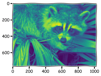
This seems like this some picture of a raccoon that is some how built into the library. Cool. And the x and the y axis seem meaningful too. They tell me how many pixels. On the x there are like 1000 and on the y there are just less than 800. Pretty cool. I didn’t know anything about this stuff but know I know a lot more but playing and trying things out.
I also added a print statement to see what was going on with face. I wanted to see how python was storing this data. Was there something weird I would need to go learn about? When I ran the code, this is what was printed in the command window:
[[114 130 145 ... 119 129 137]
 [ 83 104 123 ... 118 134 146]
 [ 68  88 109 ... 119 134 145]
 ...
 [ 98 103 116 ... 144 143 143]
 [ 94 104 120 ... 143 142 142]
 [ 94 106 119 ... 142 141 140]]
This is just a 2 dimensional array! I see this because there “ [[ … ]]” Each “[]” is a dimension. Okay, now I should be able to create a picture.
Nobody knows how this works until you learn. So if you are just learning how to code, this too may be something you would want to go an learn about – its a little scary – but not too bad. Learn about python numpy arrays here: https://numpy.org/devdocs/user/absolute_beginners.html
Let’s try:
import matplotlib.pyplot as plt
import numpy as np
DumpPic = np.zeros((10,20))
plt.imshow(DumpPic)
plt.show()
ASSIGNMENT A! Run the above code, put in different values in for 10,20. What changes? Save a picture of it. Play with those numbers until you understand what’s going on.
Now let’s try something else.
import matplotlib.pyplot as plt
import numpy as np

DumpPic = np.zeros((10,20))

DumpPic[0][0] = 255
DumpPic[0][2] = 255
DumpPic[0][4] = 255

plt.imshow(DumpPic)
plt.show()
ASSIGNMENT B!! Run that code and tell me what happens. Play with the DumpPic[0][2] with these numbers, ie change the 0 and 2. Try all kinds of things. Note they are related to command where we used “np.zeros((10,20))”, but how and in what way? I think 8-bit pictures work is that each pixel is between 0 and 255. Play with this and create a picture. Nothing fancy. Save the picture and move on.
So now starting over this is my code currently. I want to create some object called MyWorld which tells me about the amount daisies.
import matplotlib.pyplot as plt
import numpy as np
MyWorld = np.zeros((100,200)) + 130
plt.imshow(MyWorld)
plt.show()
It should just give you a boring picture when you run it. Let’s parameterize the np.zero variables so we can easily change things. Now this is what my code looks like:
import matplotlib.pyplot as plt
import numpy as np

xLength = 200
yLength = 100

Rock    = 130
BDasiy  = 255
WDaisy  = 0

MyWorld = np.zeros((yLength,xLength)) + Rock

plt.imshow(MyWorld)
plt.show()
ASSIGNMENT C! Write a sentence or two about what I did. You can use the print function to help explore variables. Hint, I have set everything to Rock!

Part II Picking a Random Number
I want to pick a spot on my world (think Longitude and Latitude). To do that I need to pick a random number or two. To do this I have to learn how to do that, I honestly don’t know how to do this in python. So I googled “python pick a random number between 1 and 10” And went to the following page:
I grabbed something that was in the numpy library. “numpy.random.randint(1, 10)”
So I went into the command window in Spyder and pasted the command a few times to see what I got.
ASSIGNMENT D! What did you get when you ran that line of code? Yep you got an error. Try “np.random.randint(1, 10)” and run it a few times and see what happens. (Pro tip, just press the up arrow in the command to get the line you just ran)
So know we want to pick a random spot on the map. How do we do that? Well I need to pick an x-coordinate and y-coordinate. How about something like: Check out this code:
import matplotlib.pyplot as plt
import numpy as np

xLength = 20
yLength = 10

Rock    = 130
BDasiy  = 255
WDaisy  = 0

MyWorld = np.zeros((yLength,xLength)) + Rock


xCoord = np.random.randint(1, xLength) - 1
yCoord = np.random.randint(1, yLength) - 1
MyWorld[yCoord,xCoord] = 0


plt.imshow(MyWorld)
plt.show()
ASSIGNMENT E! What am I trying to do when I calculate xCoord and yCoord? Write a few sentences on this. -1 is because arrays start at 0 not 1 in python. “Damn the python gods!” Remember you can always use the print command to explore. try print(yCoord) after the line where it is defined.
Part III Temperature Map!
Now I want to determine what type of daisy should grow here. Crappers I need the temperature. Let’s create a Temperature map! Now I have the following:
import matplotlib.pyplot as plt
import numpy as np

xLength = 20
yLength = 10

Rock    = 130
BDasiy  = 255
WDaisy  = 0

MyWorld = np.zeros((yLength,xLength)) + Rock
MyTemp  = np.zeros((yLength,xLength)) + 273


xCoord = np.random.randint(1, xLength) - 1
yCoord = np.random.randint(1, yLength) - 1
MyWorld[yCoord,xCoord] = 0


plt.imshow(MyWorld)
plt.show()
Notice I have the temperature in degrees kelvin. Now let’s put some logic behind whether a black daisy should go or a why daisy should grow.
- Under 285 K – 100% chance a black daisy will grow
- Above 310 K – 20% a white daisy will grow
- In-between – 50% chance a white daisy will grow and 50% a black daisy will grow
Now the code looks like this:
import matplotlib.pyplot as plt
import numpy as np

xLength = 20
yLength = 10

Rock    = 130
BDasiy  = 255
WDaisy  = 0

TL      = 285
TH      = 310


MyWorld = np.zeros((yLength,xLength)) + Rock
MyTemp  = np.zeros((yLength,xLength)) + 273


xCoord = np.random.randint(1, xLength) - 1
yCoord = np.random.randint(1, yLength) - 1
temp   = MyTemp[yCoord,xCoord]

if temp < TL:
    state = BDasiy

MyWorld[yCoord,xCoord] = 0


plt.imshow(MyWorld)
plt.show()

This basically says that if the temperature is less than TL it will grow a black daisy. What about rocks? What about white daisies! Check out this code bock:
 if temp < TL:
    state = BDasiy
elif temp > TH:
    state = WDaisy
else:
    num = np.random.rand()
    if num < 0.5:
        state = BDasiy
    else:
        state = WDaisy
ASSIGNMENT F! Now let’s switch it up and ask about the white daisy and rock. So check out this code block above. Walk through the logic a few times. Please write a paragraph that explains what is going on here. It seems easy but there is a lot going on and understanding this will be pe-pi-po-POWERFUL! It might be helpful to review this following web page.
https://www.w3schools.com/python/python_conditions.asp
Now I want to explore what the daisy’s do the temperature. So now I want to look at the temperature map. So I go to the end of the code and make the following change to the end of the code:
#plt.imshow(MyWorld)
plt.imshow(MyTemp)
plt.show()
This will plot the temperature map instead of the Daisy map. Cool right? Of course nothing is going on with it yet.
Part IV: Putting these together
Check out this code:
import matplotlib.pyplot as plt
import numpy as np

xLength = 20
yLength = 10

Rock    = 0
BDasiy  = +2
WDaisy  = -2

TL      = 285
TH      = 310

factor  = 0.1


MyWorld = np.zeros((yLength,xLength)) + Rock
MyTemp  = np.zeros((yLength,xLength)) + 273


xCoord = np.random.randint(1, xLength) - 1
yCoord = np.random.randint(1, yLength) - 1
temp   = MyTemp[yCoord,xCoord]

if temp < TL:
    state = BDasiy
elif temp > TH:
    state = WDaisy
else:
    num = np.random.rand()
    if num < 0.5:
        state = BDasiy
    else:
        state = WDaisy


MyWorld[yCoord,xCoord] = state
MyTemp[yCoord,xCoord]  = MyTemp[yCoord,xCoord] + MyWorld[yCoord,xCoord]
Tempshift              = np.sum(MyWorld) * factor
MyTemp                 = MyTemp + Tempshift
print (MyTemp)


#plt.imshow(MyWorld)
plt.imshow(MyTemp)
plt.show()
First thing I did was change up MyWorld to be from -2 to 2. This would double as an indicator as to the daisy situation -2 white daisy and +2 for black daisy and the temperature difference. This is quick fix because this model is taking too long for this class and don’t want to weigh you down too much. We will get there, don’t you worry! I did this becuae Python didn’t care about it being a number between 0 and 255 – which I found out by playing with things.
ASSIGNMENT G!! Review the paragraph above and ASSIGNMENT B. What am I talking about with the 0 to 255 thing. Check out https://photographylife.com/8-bit-vs-16-bit-images
The next thing, is that I am changing the temperature of an area if there is daisy growth. In the 1983 model they also allowed for death of daisy. That might be something to add in the future.
ASSIGNMENT H!! What does this line of code mean/do? “MyTemp[yCoord,xCoord] = MyTemp[yCoord,xCoord] + MyWorld[yCoord,xCoord]”
Then for funnizzess I decided I would allow for an overall increase (or decrease) in the temperature to the entire grid based on the one cell increase. I think we will need to look at it some more in the future, what do you think? Seems too basic.
Run it and see if it works.
Part V – Run it a Bunch!
Ok Now that I have it done for one pass. Let’s build in a loop so we can do it many many times. Note the loop. This is pretty cool. It is going to make a movie of either the temperature or the daisies depending on which image you show. Try them both out and see if it makes sense.
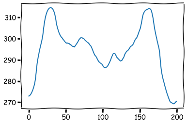
I added the ability to find the average world temperature and plot it.
ASSIGNMENT I! Review the code I added in this last final step and determine which lines I added and explain what each does and why.
import matplotlib.pyplot as plt
import numpy as np

xLength = 20
yLength = 10

Rock    = 0
BDasiy  = +2
WDaisy  = -2

TL      = 285
TH      = 310

factor  = 0.1
TempRockWorld = 273

MyWorld = np.zeros((yLength,xLength)) + Rock
MyTemp  = np.zeros((yLength,xLength)) + TempRockWorld

TotStps = 200
aveTemp = np.zeros(TotStps)
for tt in range(0,TotStps):

    at          = np.average(MyTemp)
    print(tt, at)
    aveTemp[tt] = at

    xCoord = np.random.randint(1, xLength) - 1
    yCoord = np.random.randint(1, yLength) - 1
    temp   = MyTemp[yCoord,xCoord]

    if temp < TL:
        state = BDasiy
    elif temp > TH:
        state = WDaisy
    else:
        num = np.random.rand()
        if num < 0.5:
            state = BDasiy
        else:
            state = WDaisy


    MyWorld[yCoord,xCoord] = state
    MyTemp[yCoord,xCoord]  = MyTemp[yCoord,xCoord] + MyWorld[yCoord,xCoord]
    Tempshift              = np.sum(MyWorld) * factor
    MyTemp                 = MyTemp + Tempshift


    plt.imshow(MyWorld)
    #plt.imshow(MyTemp)
    plt.show()

plt.plot(aveTemp)
THIS IS A TERRIBLE MODEL as is. I am failed professor – at least that is always the way I feel when I build something for the first time. For example my temperature doesn’t seem like it has stabilized at all. Check out this plot.
ASSIGNMENT J! Write a paragraph or two of how can I make changes to the code to make this work better. Be creative and come up with some cool ideas. Anything works. Its okay to share your feelings on it. The point of this is to be messy. In two or three weeks we will come to this and fix it.